Teaching unfamilair interaction techinques to the visually impaired.
All mobile applications widgets that are translated into different forms bsaed on the app use case or the language of the particular product.
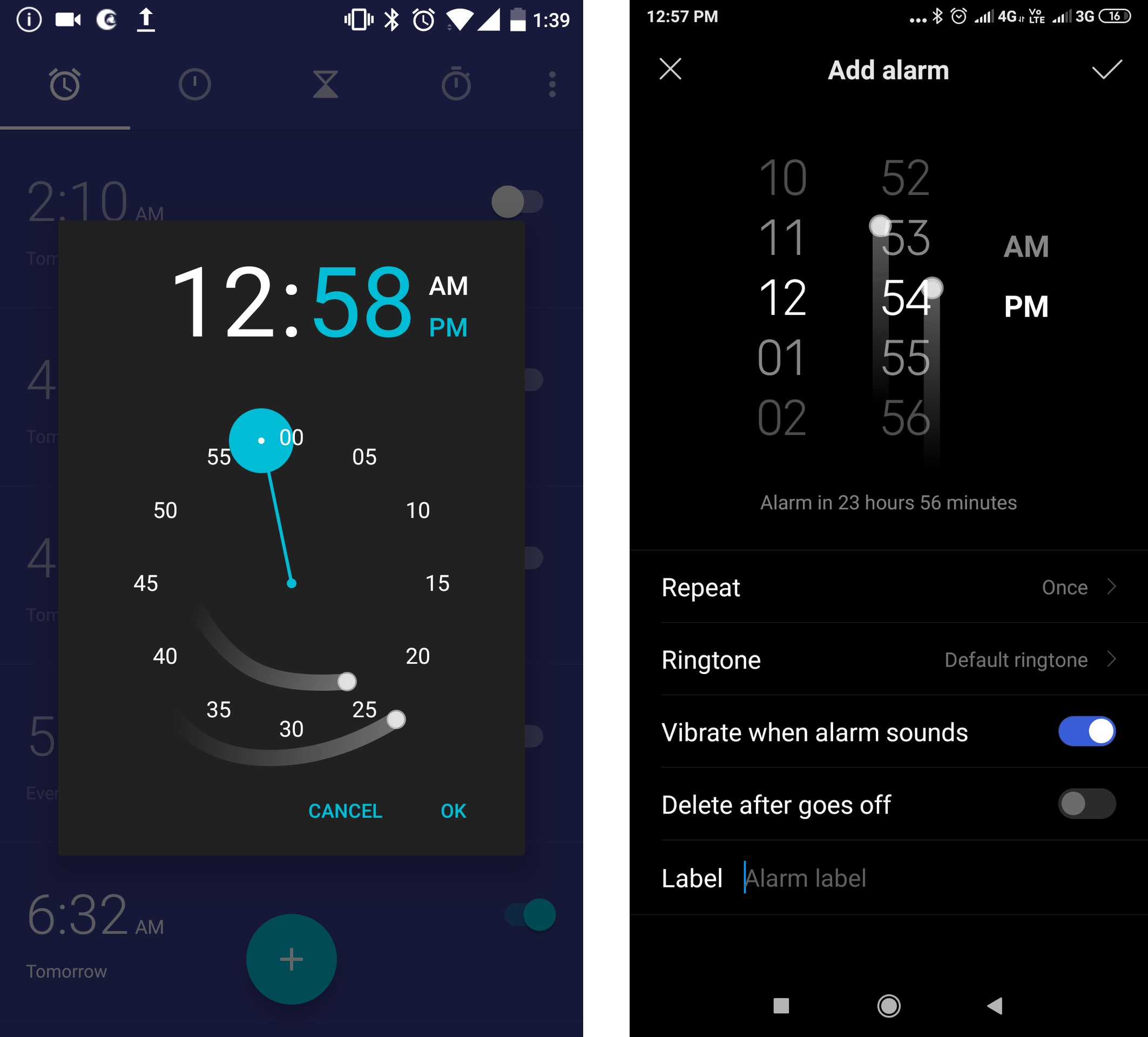
For ex: Time picker is circular analog in certain applications while it is bifocal dial in certain applications. So circular dial requires users to
pick from digits placed circularly and an bifocal requires user to swipe to the right digit.

Visual cues on the interface help sighted users to
pick the right digits, but when it comes to screen readers all digits are read out as buttons that can be selected and the layout of the arrangement is
lost based on user's model of the time picker(circul/bifocal) causing the user to spend more time on the interface and losing interest.
This project experiments if teaching unfamiliar widgets helps persons with visual impairement learn these widgets.
Users are unaware of the arrangement of the widget components:
To locate the widgets and it's compoenents on the screen an mental image has to be developed which passes the shape and position of the layout to the user by practising. Here's an video to explain it.
Following video(8 min) explains my intervention👇:
Along with this there is another teaching method which I prototyped:
Got any feeback for me?
Please let me know if you want to discuss this project or about my work :)