Re-Designing Live class filtering
Context
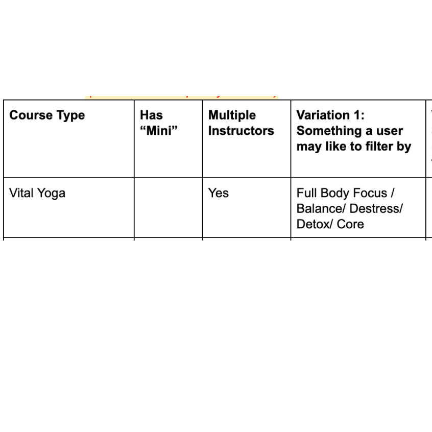
Mindhouse is an meditation app and offers 7 different courses/techniques and 4 courses have a mini version also. Each course has different types and classes are taken by different instructors. A way to think about it would be through a university analogy. Physics is the course. It could have multiple classes, with different professors, and different material being taught in each class. In total there are about 70 different classes in a single day on the app.
Check out Mindhouse"Make it easier to choose a live class for the user"
Intro to the app
To understand the app, it’s a guided meditation tool(Like Headspace) but it has trainers who take live classes. I worked with Ashish Goel who leads the design at Mindhouse. Mindhouse used to have a physical studio where the classes happened but then COVID-19 struck and like all businesses Mindhouse shifted to online. So one of the primary interfaces that the app has is the Book tab. This lists down all the classes that are scheduled in a certain week which you can book and attend.
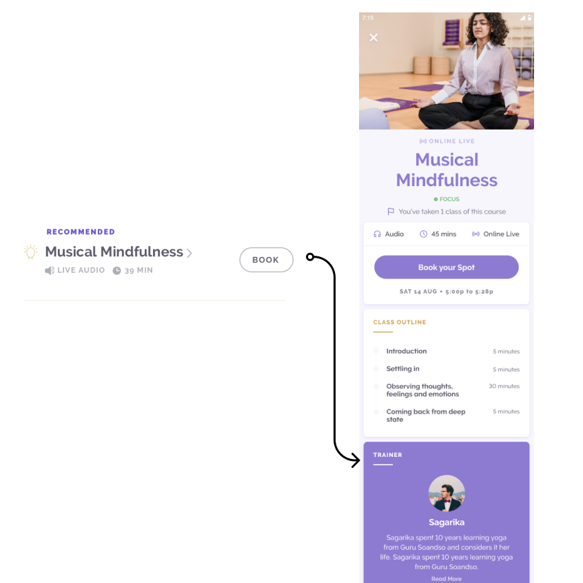
Check out the appFollowing is the existing live classes booking page and the parts of it:
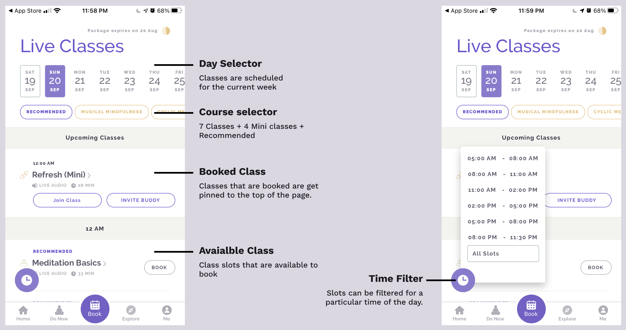
Because of the large number of classes(approx 70 per day), currently it is hard for a user to choose the class they are looking for. Because while booking a slot of the class they want, Users are looking for Course name, Sub class type name, Is it taken by their favourite instructor, what time of the day is the class available etc., So users need to have this information first hand for selecting the class they want and find it easily.
Skimming through these different types of information cards and finding what they're looking for should be easy.
To find these classes following filtering techniques and design changes are made to the existing live classes page:
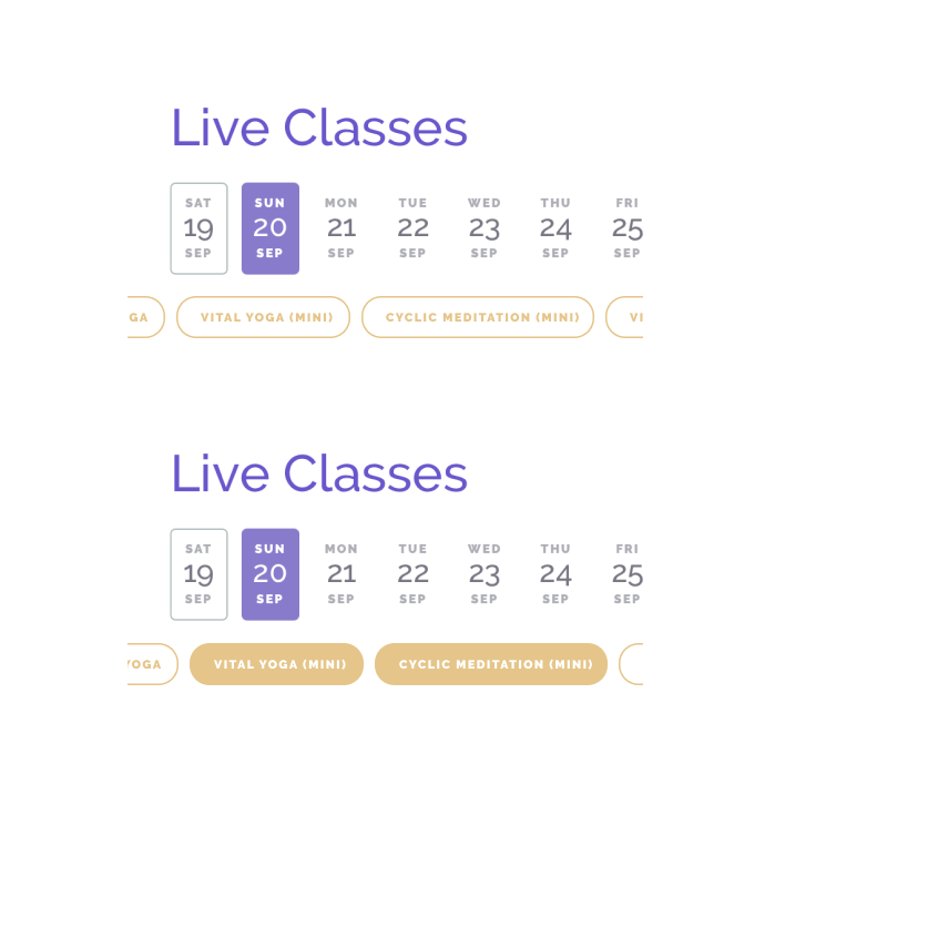
Day Selector
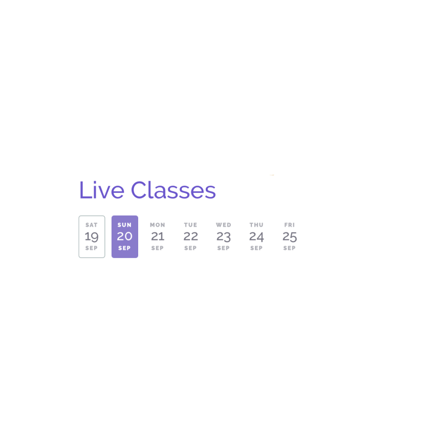
Old
In the past, people booked for the full week in advance because physical classes had limited capacity, but since online classes can be booked anytime, most people were booking right before the time slot
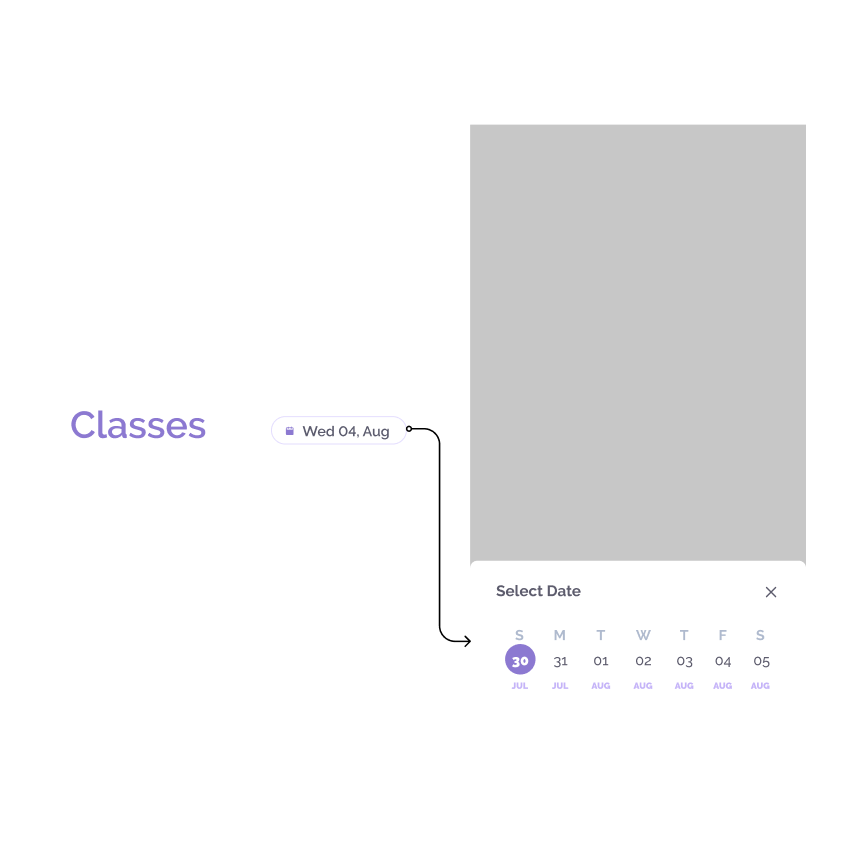
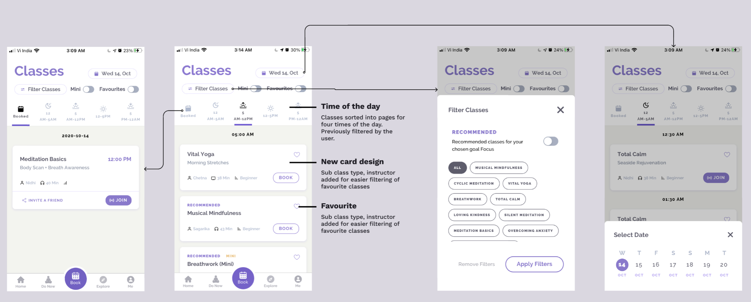
New
Since the date filter is not a frequent interaction element, I decided to remove the filter to add vertical space. The new date selection is a button that opens up the selector as a modal.
Time of the day slots
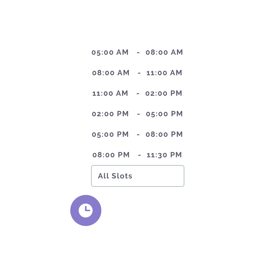
Old
Users primary mode of interaction for finding out the class they are looking for is the time of day. When changing from morning to evening time slot the floating action button on the left has to be opened every time. Also, when the time slot is changed the page gets refreshed.
New
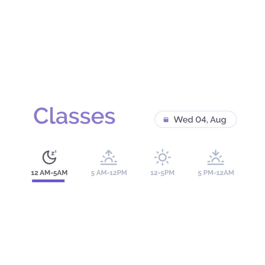
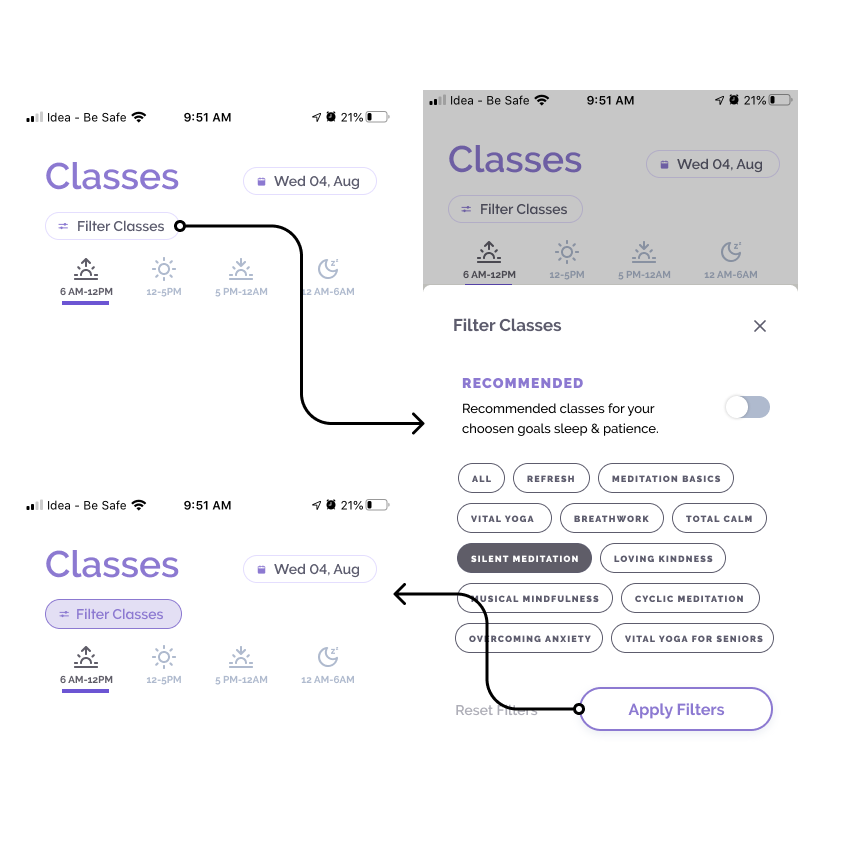
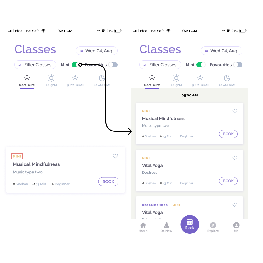
Since there are 70 classes on average per day, I changed the time slot filter from floating action button to tabs on the top. Realising that these classes can be find based on Early Morning, Morning, Afternoon, Post evening I added these as the ttabs.
Class Filters
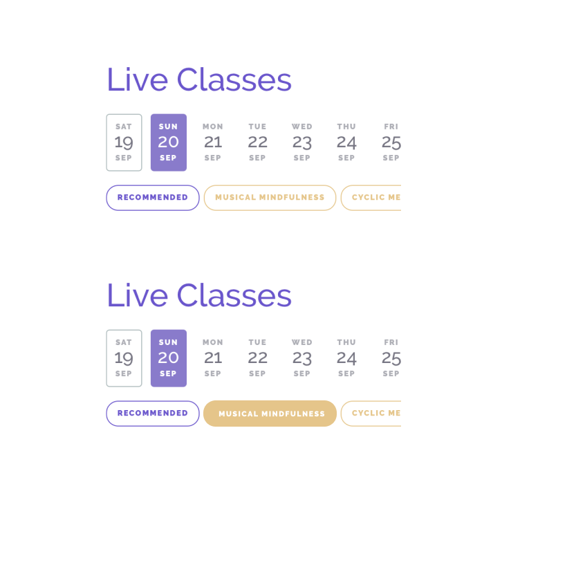
Old
To see all the slots available for a particular class, users are required to select the class from the carousel on the top represented as pills. To view all classes users are required to select all the pills.
New
Filtering classes is the ssecond most important interaction element used. Putting all the classes together at one place in a modal as opposed to the existing carousel allowed users to view all the selected classes at a glance and also deselect faster. 'All' has been added to select all classes at once instead of deselecting all the pills. Recommended classes for the user's goals can be selected by toggling 'recommended' ON.
Finding favourite instructor
Old
A class can be taken by multiple instructors. Users prefer certain instructors and it’s not possible to choose based on the instructor. So people open the class and then have to find out the instructor.
New
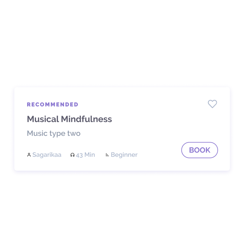
I added the instructor name on the card as metadata along with duration, practice level. Users can now view the instructor name while viewing the slots instead of going inside and finding out.
Sub Class Type
Old
Users maintain a note for vital yoga upper body and lower body(remember the physics analogy?) which is not possible in the existing book page. For Ex: There’s a course name which is primary(Vital Yoga) and then the class type which is secondary(Upper body/Lower body)
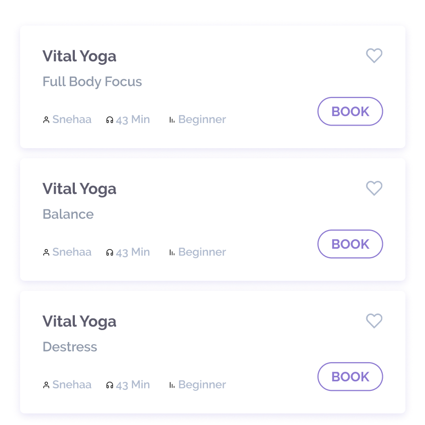
New
Slot cards have been added with the sub class type along with the main course name. The title on the card in dark gray is the course name title and the sub class type is in lighter gray.
Save that favourite class
Old
Users have preferences when it comes to live classes mainly focussing on a particular type of class taken by a particular instructor. Even when the instructor name is added in the metadata users repeat these classes and currently, they have to repeat that action every time-searching for a particular class and then a particular instructor
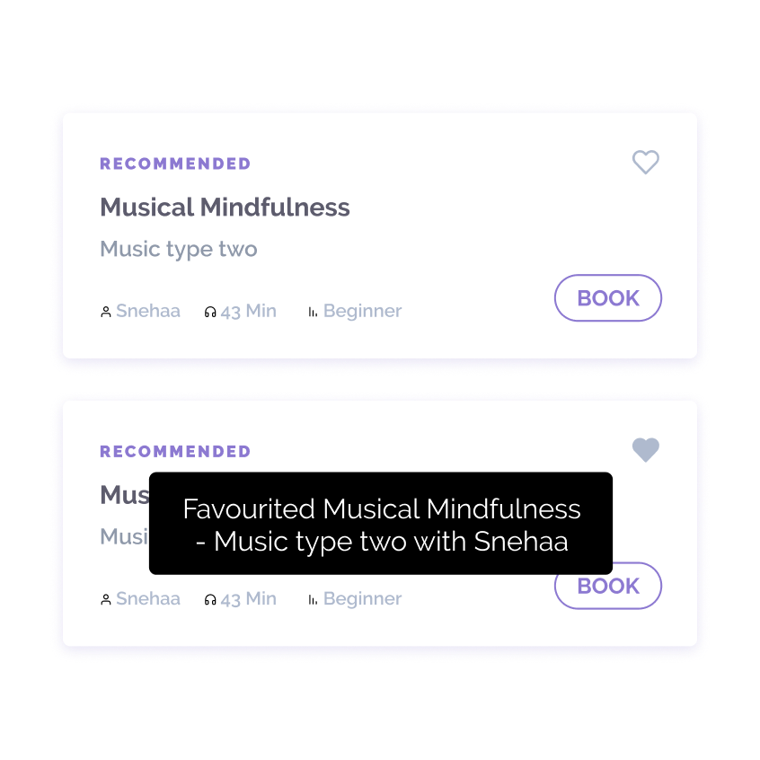
New
I added a favourite action to save these classes as favourites and then book that class whenever it’s available in the week. Because saving these classes makes it easier to repeat a live class of favourite instructor or technique. Since each class also has a subclass type the favourite button saves the class+sub class type+instructor.
Viewing favourite classes
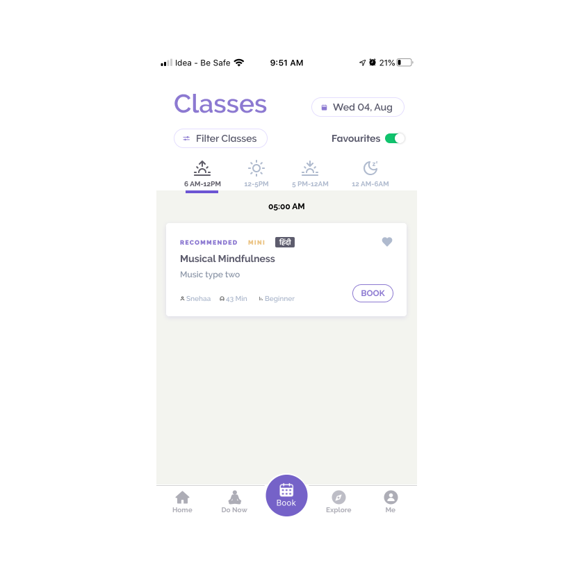
To access those favourite classes I've added a favourite toggle along with the Mini toggle.
Mini Duration Classes
Old
Each course has a longer duration and a shorter duration and currently, these two are separate courses resulting in the users requiring to choose a shorter duration class as a separate course. That means when users select Musical mindfulness the shorter classes are not shown
New
Mini is added as a toggle on the top to easily filter shorter duration courses. Since users can join a live class this lets anyone who is looking for a quick short class
Booked classes
Old
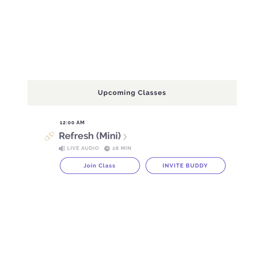
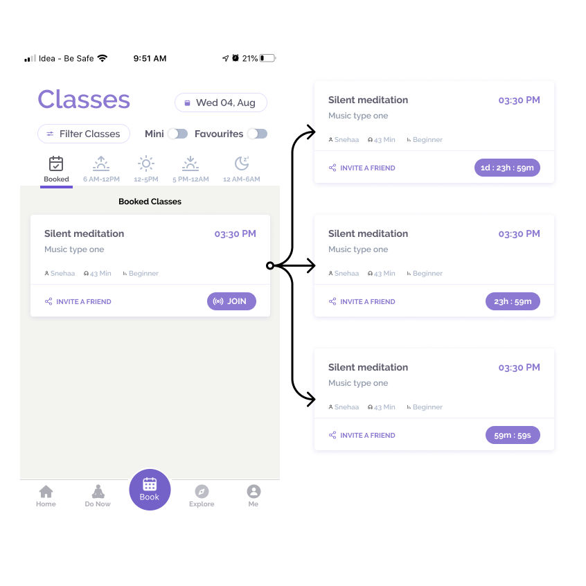
Classes that are pre booked are pinned on the top of the list with time of the class, class details with a 'Join Class' and 'Invite Buddy'. Classes that are booked and live can be joined from here.
New
The time of the booked class is not visible and so it is moved to the right and made bigger in font size increasing the visibility while showing the info the class with the metadata. For classes which are live have a 'JOIN' button while classes upcoming have a countdown timer.
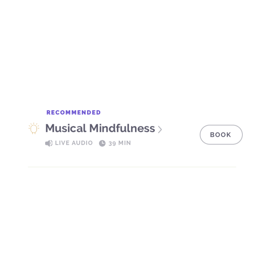
New Card design
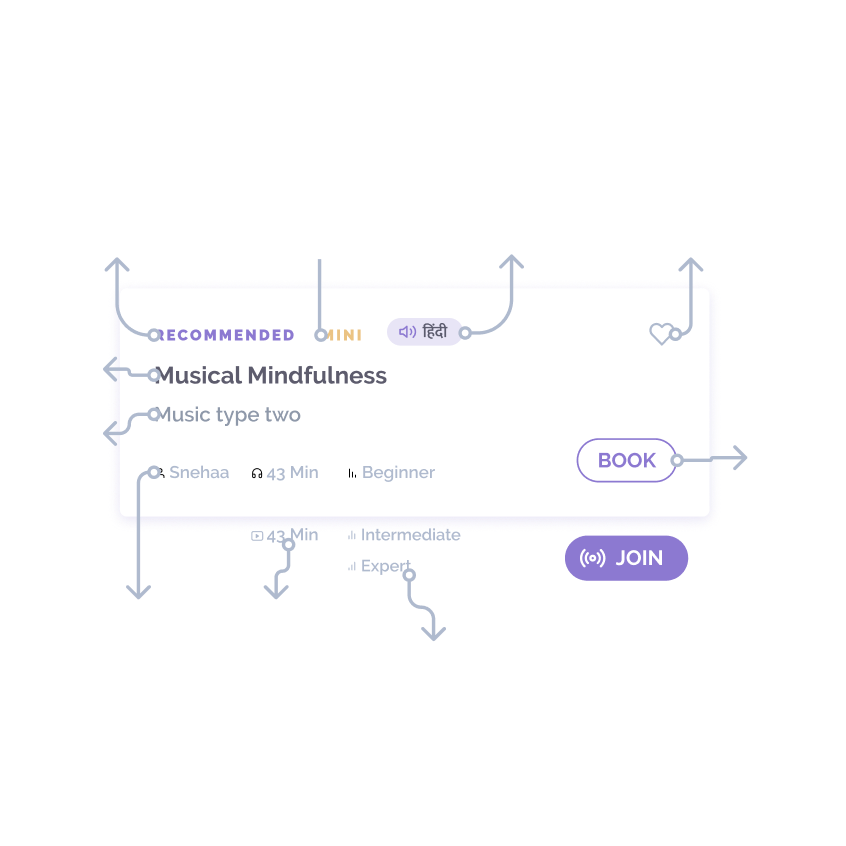
Finally, the new card design and the filters allow user to choose classes that are by their favourite instructor, class type and time of the day. The information avaialable on the card are:
• Recommended, Mini, Hindi
• Class Name
• Sub Class Type
• Instructor name, Format & Duration, Experience level
• Book/Join
This was a month long work
I can show you the iterations we did and how we dropped certain other designs and reached at a final idea which got delivered.